ForeUI is an easy-to-use UI prototyping tool, designed to create mockup / wireframe / prototypes for any application or website you have in mind.

Archive for June, 2010

ForeUI V2.32: Scrollable Container and More

7

Hi everyone, new version again 🙂  This release bring us a new “Scrollable Container” element which can make things scrollable.  Also there are more new features and enhancement, please read on.

Scrollable Container

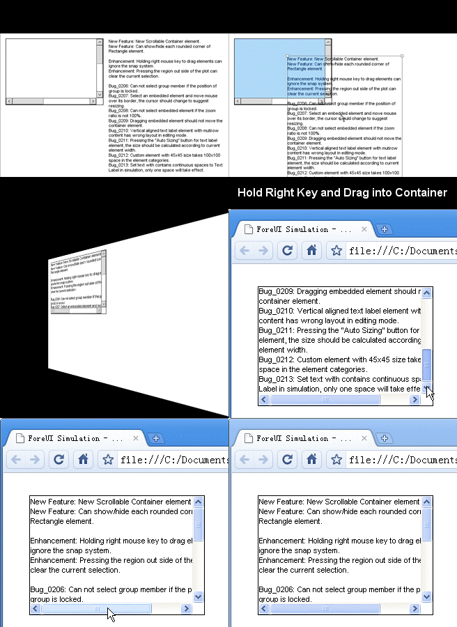
ForeUI provides the scrollbar element from the first version, however the scrollbar is not interactive and you could not really scroll content.  From V1.90 the table element supports content scrolling, and the table can be used as a container from V2.22, thus you can use the table element as a scrollable container, however the table element does not support vertical scrolling yet.  So we implement a new scrollable container element in this version, which allow you to make any element scrollable.

Just like the table element, you can hold the right key and drag element into the scrollable container.  Please remark that only one element can be embedded into the scrollable container, if you want to make complex content scrollable, you can group the content together and then add the group into the container.

Rounded Corners for Rectangle

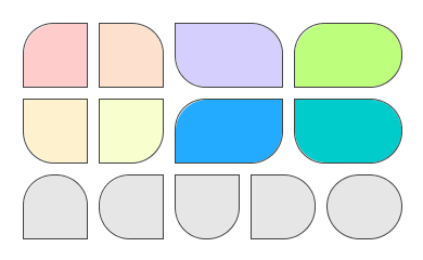
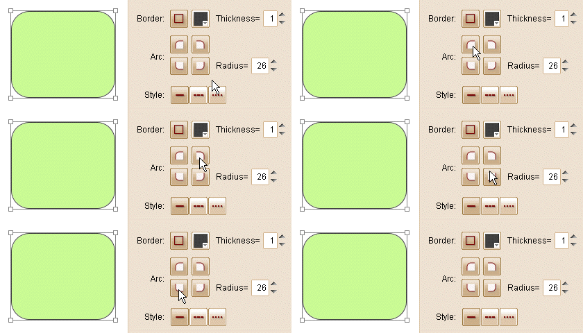
The rectangle element supports rounded corner from V1.45.  From this new version, you can show/hide each rounded corner of the rectangle, like this:

It seems like a small feature but it is really useful, as you can create more new shapes now:

New Example Plot: Fwitter

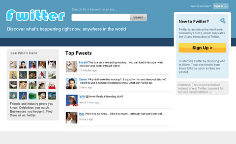
From this version we include a new example plot named “Fwitter”.  It is a complex, high-fidelity prototype which simulate the UI and behavior of Twitter.  You can sign up, sign in, browse, search or even “post” new content.  This example is so big that will take some time for loading if you like to preview it online.  So it is recommanded to download and run it locally, you can find it in the community site.  This example is also included in the latest install package.

Other Enhancements:

  • Holding right mouse key to drag elements can ignore the snapping system.
  • Pressing the region out side of the plot can clear the current selection.

Fixed Bugs:

  • Bug_0206: Can not select group member if the position of group is locked.
  • Bug_0207: Select an embedded element and move mouse over its border, the cursor should change to suggest resizing.
  • Bug_0208: Can not select embedded element if the zoom ratio is not 100%.
  • Bug_0209: Dragging embedded element should not move the container element.
  • Bug_0210: Vertical aligned text label element with mutirow content has wrong layout in editing mode.
  • Bug_0211: Pressing the “Auto Sizing” button for text label element, the size should be calculated according to current element width.
  • Bug_0212: Custom element with 45×45 size takes 100×100 space in the element categories.
  • Bug_0213: Set text with contains continuous spaces to Text Label in simulation, only one space will take effect.
iPhone App Mockup Library Updated

2

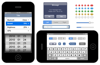
I’ve just submitted a new version of iPhone app mockup  library in the community site.  This version contains 28 elements for iPhone app wireframing.

Title bar, search bar, slider, progress bar, tabs… All these new elements are very useful for creating iPhone app mockup.  Some of them are even interactive, which means you can interact with them in the DHTML simulation.

All elements in this library are created with some basic elements in ForeUI.  You can create your own element, even the interactive element can be defined by adding a few event handlers.

Download the Library

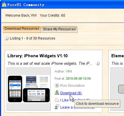
You can download the library in ForeUI, just click the “Resource Sharing” button on bottom left corner to open the community window:

Then you can download the library by clicking the “Download ” link, as shown in figure below:

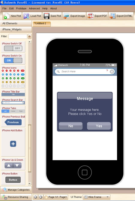
The library will be deployed automatically after the downloading, and you will find a new “iPhone_Widgets” element category on the left of ForeUI window.  Then you can use the new elements inside for iPhone app wireframing.

Also you can download the library from our community website, but you would need to deploy it by yourself, the .fcl is a ZIP file, which contains 28 .fce files inside.

Create Mockup for iPhone App

Using the new iPhone elements is quite easy, just drag the elements from the left list into the editing area.  Nothing different than using other elements.

Actually we can use these iPhone elements to create two kinds of mockups for iPhone app:

  1. iPhone mockup with “app running inside”.  The iPhone shell will be included in the mockup.  The simulation can be run on any device with web browser.
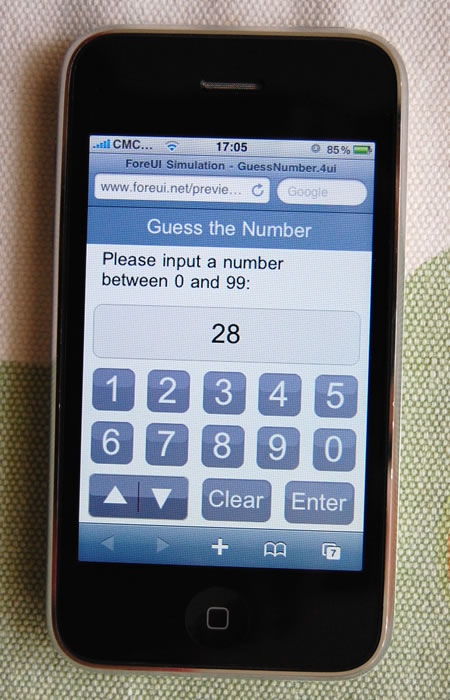
  2. App mockup without iPhone shell.  The mockup can be run in iPhone web browser to simulate a “real” running app.

The difference is whether to include the iPhone shell.  The mockup without iPhone shell allows you to run the 1 : 1 simulation on iPhone, which provides the experience that close to the real app.

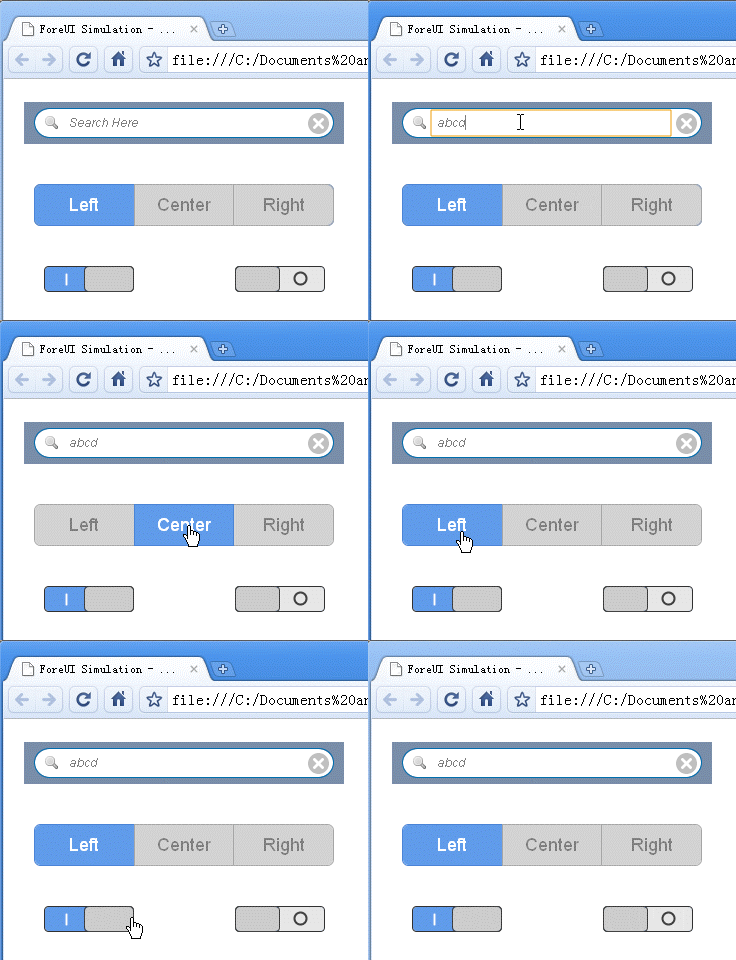
Recently I’ve created an interesting mockup for a “Guess the Number” game in iPhone, you can also find it in the community window or here.  If you run its simulation on PC, you will see the simulation like this:

It’s cute since you can really play with it, although it doesn’t look like an iPhone app. But if you launch the simulation in iPhone web browser, things become much more interesting, you can really play the “app” on your iPhone!

Want to try it on your iPhone?  That’s easy, if you are browsing this page with iPhone, just click here to launch the simulation.

Something need to mention:

  • Since the mockup is running in web browser,  it seems not possible to get rid of the navigation bar on top and the status bar on bottom, but scrolling up a little bit can move the navigation bar out of screen.
  • Although the resolution of iPhone is 320 x 480, the navigation bar and status bar take about 120 pixels height, so the actual mockup size is 320 x 360.

Here I am showing an extreme example, not only the GUI but also the logic of the game is simulated in the mockup.  In actual cases, you need to make a compromise between the mockup details and the workload of prototyping.

ForeUI V2.30: Enhanced Resource View and New Text Editor

Dear friends, today we release ForeUI V2.30 as we scheduled.  This version bring us a better resource view from community site and a new text editor for TextBox editor.  Some useful enhancements and bug fixings are included.

Enhanced Resource View

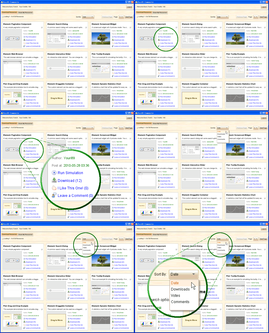
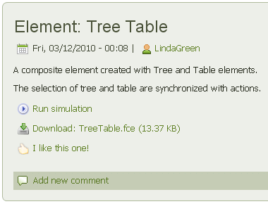
In previous versions, the resource view in the community window can list only 3 resources a time, that’s far from enough.   Now we have redesigned the resource view and it can list more resources in a page.   What’s more, the new resource view provides more interesting features:

  1. Run Simulation: you can preview the plot or custom element with just a single click.  The simulation will be generated on server side and you can run the simulation in your web browser.
  2. Vote Up Resource: if you like a resource, please vote it up.  It is a new mechanism to encourage people to share their resource.
  3. Leave Comment: it exists in previous versions, but now it is better: you can leave comment without opening browser, all things can be done in ForeUI!
  4. Statistic Numbers: the number of downloads, votes and comments will be shown after the action link.
  5. Sort Resources: you can sort resource by time, downloads, votes or comments.

Also you can launch these features from web browser (visit http://www.ForeUI.net/):

New Editor for TextBox

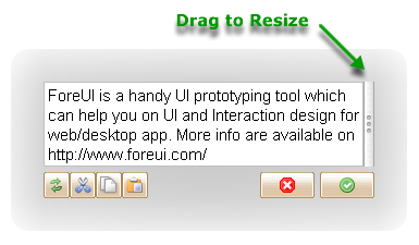
This feature is suggested by Jeremy Kerr.  The new editor allows you to explicitly change the width of the editor (and the TextBox), the text content will be wrapped automatically.   Comparing with the old editor, this one can handle big paragraphs copy & paste much better.

If you drag the resizer of the right to change editor size, the editing TextBox will also be resized after  the editing.

Embedded Element Selection Arithmetic

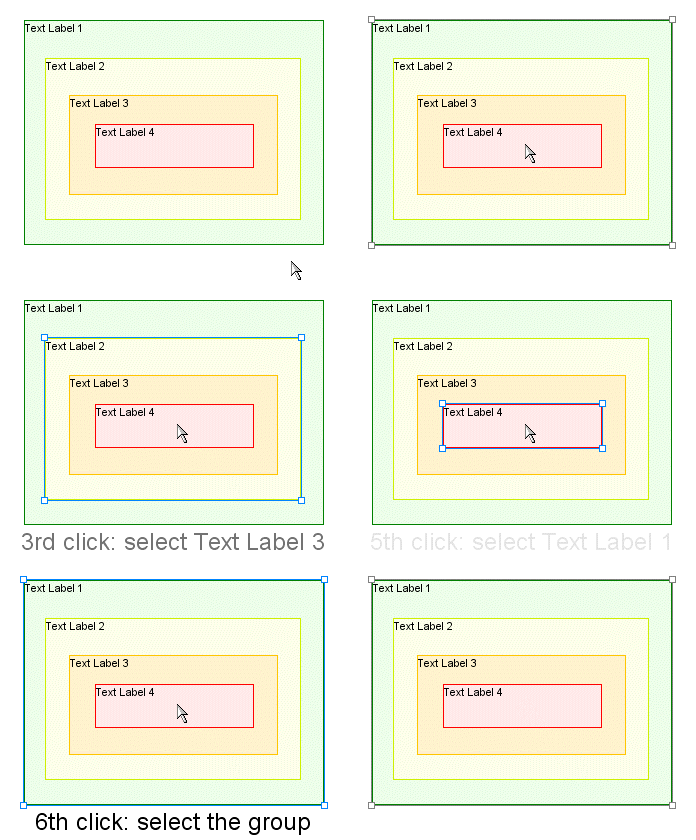
Now selecting element in container (group or table) become easier.  We change the arithmetic to make sure every element can be selected even they are overlapped.  The animation is an example for embedded element selection:  The 4 text labels are overlapped and they are packed into a group, clicking the center area can select any one of them.

Other Enhancements:

  • Content editing has higher priority than member selection when double clicking member in group.
  • Allow adding batch of .fce files into “Custom Element” category a time.
  • When export DHTML to non-empty directory, explicitly ask whether to clean up before exporting. Will only clean up the “images”, “scripts” and “styles” folders with confirmation.   (as discussed in forum)

Fixed Bugs:

  • Bug_0142: Table element can not layout “incomplete” row properly in simulation. (Mentioned here and here)
  • Bug_0200: Line element with thickness > 1 will be trimmed in simulation.
  • Bug_0201: The sub menu width of Multilevel Menu is not properly calculated if default font is set to “Verdana”.   (Thank Ulrich for reporting)
  • Bug_0202: When copy and paste nodes in behavior editor, the newly pasted node is collapsed by default. (regression in V2.27, thank Hervé Séger and Ulrich for reporting)
  • Bug_0203: Text editor does not reflect the bold or italic style of the editing text element.
Hervé Séger