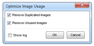
Please consider changing the layout of the “Optimize Image Usage” dialog.
– A Cancel button is missing.
– After optimization is done all I can do it press the X in the top right corner.
– The log is not (always) interesting
I have made a prototype of my suggested design:
– You can click Cancel if you change my mind.
– When clicking OK the dialog is closed and the optimization is done.
– If you would like to see the log, you can check the checkbox and after pressing OK, a small dialog with the log details and an OK button should be shown.
What do you think?
3 answers
Hi Ulrich,
Thanks for the prototype. I believe this design fits your habit better, but the current design does nothing wrong actually. It is simple, and has no misleading information. We don’t plan to change it since it is working well for users.
This question is now closed
