The design/development of ForeUI V3.0 is just started, and I have some time to write something. I plan to write a series of articles to introduce some advanced tricks of ForeUI usage, which will be very useful for all ForeUI users.
Today’s topic is: how to make your ForeUI plot smaller? The “plot” here means both the saved .4ui file and the exported DHTML simulation files. The benefits to make plot smaller is obvious: smaller plot can be loaded/saved faster for editing, and smaller simulation files can be launched quickly in your (and reviewers’) web browser. Here are some tricks to minimize your plot size:
Use Master Page to Avoid Duplication
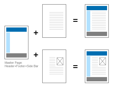
Usually there will be some common parts between pages in your plot. Although you could duplicate elements or even the entire page to make every page have the common parts, you are encouraged to move the common parts to a master page, which can be shared by other pages.
This trick is frequently used for pages that have the same header, footer or side bar. For example, all pages in your plot has the same header, footer and side bar. So you can place them in a page, and all other pages use this page as the master page. Thus you can just manage the center content on other pages, the figure below shows the details.
 What if some pages have different side bars, while they have the same header and footer? In this case you can use this master hierachy:
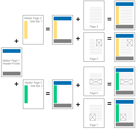 There are 3 pages are used as master pages. Master Page 1 is shared by Master Page 2 and 3, while Master Page 2 is shared by two pages (Page 4 and 5) and Master Page 3 is shared by another two pages (Page 6 and Page 7). This hierarchy should meet the requirements for most web site/app prototyping.
By using master pages, you can avoid duplicating content in the plot, and significantly reduce your plot size.
Optimise Image Usage
Experiments show that using images is the best way to enlarge your plot. So if you wish your plot become smaller, make sure your plot only includes the images that are necessary. It seems superfluous words, who would like to include unnecessary images in the plot? But sometimes you may do this unconsciously, consider this case: you add an Image Box element and specify an external image file for it, after a while you delete that Image Box and forget it. But the image is still stay in the Image Dock, and will be saved to plot file even it is not referenced anymore. If you did this a lot, your plot will be quite big, although most of the images in Image Dock are not used actually.
Shouldn’t ForeUI just take care of this situation and optimize it automatically? I can’t agree more, so we will have it in V3.0, but we still have to do the optimization manually before 3.0 is out. How to know if an image is referenced then? You can click on the image in Image Dock, then you will see a pop-up menu like this:
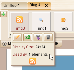 You can see how many elements are referencing this image. If an image is not used by any element (used by 0 elements), you can just click the
  button to remove it safely. Remarks: you will need to update to V2.802+ to have the correct image reference number (fixed Bug_0309).
Besides removing the unused images, you can also merge the duplicated images in Image Dock, which will also reduce your plot size. Again ForeUI V3 will provide this feature, but we need to do it manually for now. For example, say you have two images (img0 and img1) in Image Dock, they are duplicated and any of them are used by other elements, how could you merge them?
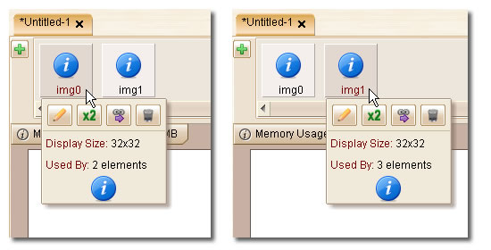 You can choose one image to keep, and click the
  button for another image to change all references to the one will be kept. For example, you like to keep img0 (merge img1 to img0), you can click the
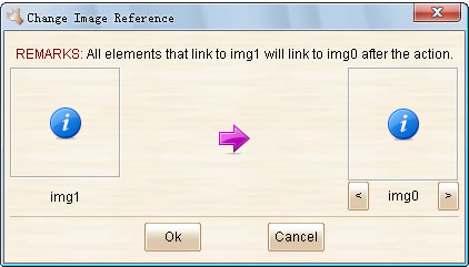
  button for img1, then you will see this window:

After you click the “Ok” button, all references to img1 will be changed to img0. So nobody is using img1 now, and you can safely remove img1.
By removing unused images and merging duplicated images, your plot will become much smaller. You don’t have to do this kind of optimization all the time, but you’d better do it once before exporting the plot to DHTML.
Use Text Box to Replace Big Rectangle
Rectangle is a very frequently used element in prototyping. However when you want to add a big Rectangle into your plot (e.g. make it as background), you can consider using a Text Box (with border shown, background filled) instead.
Why? Because the Rectangle element will be converted to an image file when you export the plot to DHTML, bigger Rectangle will generate bigger image file. While the Text Box will be converted to just a snippet of HTML code, its size will not change when you enlarge the element. So if you need a big rectangle, consider using a Text Box with border and background first, as long as you don’t need the radius corner feature provided by Rectangle element.
If your plot has many big rectangles and you replace them to Text Box elements, your exported DHTML files will become much smaller.
Conclusion
In this article I introduced three approaches to reduce your plot’s size. It is not just about saving the space in your hard drive, it can also significantly reduce the DHTML files generated by ForeUI. If you upload the DHTML files to the Internet for people to review, smaller file size is bandwidth and time saver. I would suggest all ForeUI users to try using this approaches, and create small and powerful prototypes.
 We also made some enhancements on opacity adjusting in either the tools panel and the behavior editor. In previous versions, you can input the opacity value as 0~255 integer, and when you define the action to change the opacity, you will input a percentage. It is not comfortable that they use different system, while they are actually setting the same thing. However we prefer to keep both systems as they are all useful. Adjusting number between 0 and 255 is more accurate, while displaying % is more intuitive. So we finally implement it like this:
 Enjoy 🙂
 What if some pages have different side bars, while they have the same header and footer? In this case you can use this master hierachy:
 There are 3 pages are used as master pages. Master Page 1 is shared by Master Page 2 and 3, while Master Page 2 is shared by two pages (Page 4 and 5) and Master Page 3 is shared by another two pages (Page 6 and Page 7). This hierarchy should meet the requirements for most web site/app prototyping.
 You can see how many elements are referencing this image. If an image is not used by any element (used by 0 elements), you can just click the
  You can choose one image to keep, and click the