Element Tooltip
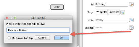
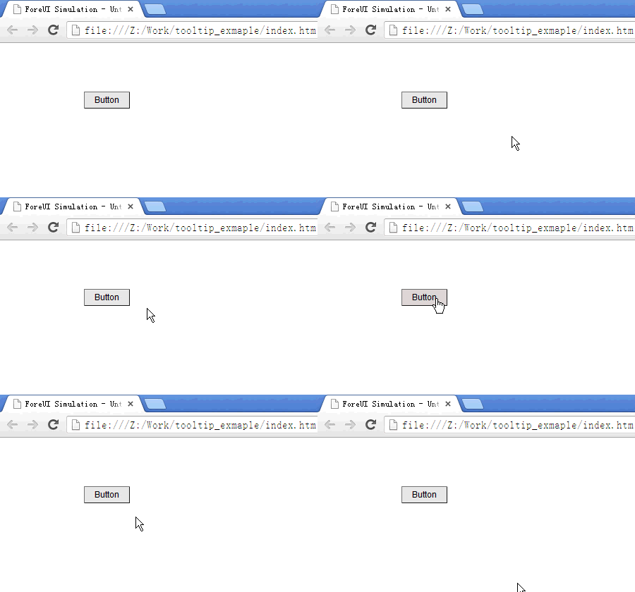
The newly released V3.2 introduced a very useful feature, which allows you to set the tooltip for any element. It is a real tooltip: once the it is set, it will take effect automatically in the simulation. You don’t need to simulate the tooltip by yourself anymore.
Here is how it will look like in the simulation:
If the tooltip is not set (empty), the element will not have tooltip in simulation, just like it did in the previous versions.
Selected/Unselected Event for Checkbox/Radio Button
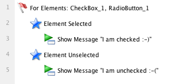
Since this version, you don’t need to check the checkbox/radio button state in a conditional branching anymore, just handle the “Element Selected” or “Element Unselected” events for checkbox/radio button, and you will get notified when the element selection state is changed.
New Action to Change Button Text
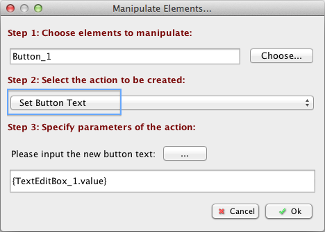
Now you can use the new “Set Button Text” action to change the text on the button. That means you can have some dynamic button in your prototype.
Change Element Order
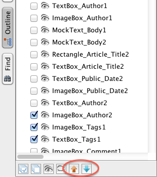
If you create some elements with the same Z value, the only thing that decides how to overlap them is the element order. The element with smaller order index will be rendered earlier. Now you can change element’s order in the outline view: just select the element and click the “move up” or “move down” button at the bottom, you will see the overlap order is changed accordingly.
Hotkey to Group/Ungroup Elements
Now you can press Ctrl+G to group the selected elements, and press Ctrl+Shift+G to ungroup the group you selected. If you are using Mac OS X, the hotkey should be Command+G/Command+Shift+G.
There are More
There are more enhancements in this version. Please read the update history for more details.
