Tabs belongs to the "Widgets" category and it has different look in various UI themes.
UI Theme: |
Hand Drawing |
Wire Frame |
Windows XP |
MAC OS X |
Window 7 |
Legend |
|
|
|
|
|
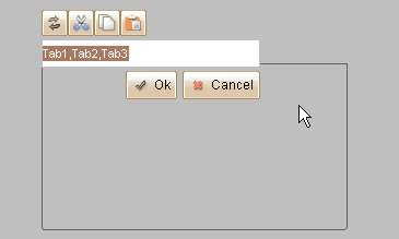
Double clicking the Tabs element can change the titles of its tabs. The titles are separated with comma, if you need to use comma in tab title, use '\' to escape it.

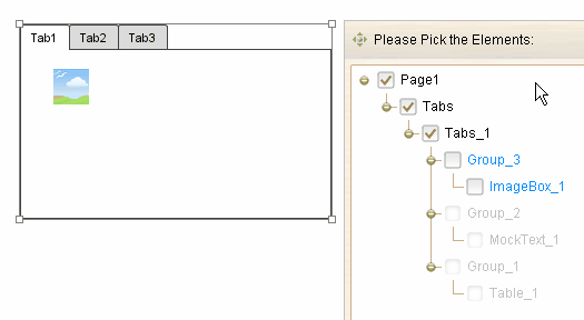
Tabs is a container element, and each tab can serve as a container. The elements that embedded in inactive tabs will be hidden.

Element Specific Facilities

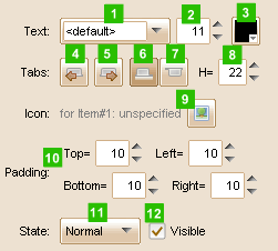
| 1. | Font of the tab titles |
| 2. | Font size |
| 3. | Text color |
| 4. | Select previous tab |
| 5. | Select next tab |
| 6. | Show tabs on top |
| 7. | Show tabs on bottom |
| 8. | Set tab height ( in pixels ) |
| 9. | Set icon for selected tab |
| 10. | Set container padding (in pixels) |
| 11. | 12. Change state for tabs |
Element Events
Element Clicked, Element Double-Clicked, Element Right-Clicked, Element Initialized, Element Hidden, Mouse Over, Mouse Out, Mouse Move, Mouse Down, Mouse Up, Global Mouse Move, Global Mouse Down, Global Mouse Up, Key Down, Key Up, Custom Event, Selection Changed
Element Actions
Change Visibility, Change Location, Change State, Set Selected Index
Element Properties
Id, X Coordinate, Y Coordinate, Width, Height, Visible, Note