Text Edit Box belongs to the "Widgets" category and it has different look in various UI themes.
UI Theme: |
Hand Drawing |
Wire Frame |
Windows XP |
MAC OS X |
Window 7 |
Legend |
|
|
|
|
|
Text Edit Box element can accept user's input, and can serve as input field, multi line text editing area and password field. You can double click the Text Edit Box element to change its default value.
If you need a Text Edit Box with custom look, you can hide its border and place image or other elements under it.
Element Specific Facilities

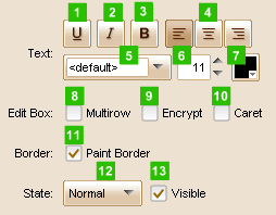
| 1. | Underline the text |
| 2. | Make text italic |
| 3. | Use bold font |
| 4. | Text alignment |
| 5. | Font of the text |
| 6. | Font size |
| 7. | Text color |
| 8. | Multiple row mode |
| 9. | Show as password |
| 10. | Show caret in edit box |
| 11. | Show / hide border |
| 12. | 13. Change state for text edit box |
Element Events
Element Clicked, Element Double-Clicked, Element Right-Clicked, Element Initialized, Element Hidden, Mouse Over, Mouse Out, Mouse Move, Mouse Down, Mouse Up, Global Mouse Move, Global Mouse Down, Global Mouse Up, Key Down, Key Up, Custom Event, Focus Gain, Focus Lost
Element Actions
Change Visibility, Change Location, Change State, Set Value of TextEditBox, Set Focus
Element Properties
Id, X Coordinate, Y Coordinate, Width, Height, Visible, Note