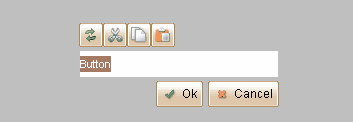
Button belongs to the "Widgets" category and it has different looks in various UI themes.
UI Theme: |
Hand Drawing |
Wire Frame |
Windows XP |
MAC OS X |
Window 7 |
Legend |
|
|
|
|
|
Double clicking the Button element can change its text label.

Button can accept image as its icon. You can change its icon from floating tool pane, or drag image from image dock directly into the button.
![]()
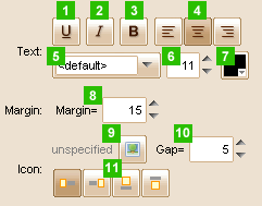
Element Specific Facilities

| 1. | Underline the text |
| 2. | Italic the text |
| 3. | Bold the text |
| 4. | Align of the text |
| 5. | Font of the text |
| 6. | Text size |
| 7. | Text color |
| 8. | Text margin ( in pixels ) |
| 9. | Set icon on the button |
| 10. | Set the distance between the icon and the text ( in pixels ) |
| 11. | Set the icon's position with the text |
Element Events
Element Clicked, Element Double-Clicked, Element Right-Clicked, Element Initialized, Element Hidden, Mouse Over, Mouse Out, Mouse Move, Mouse Down, Mouse Up, Global Mouse Move, Global Mouse Down, Global Mouse Up, Key Down, Key Up, Custom Event
Element Actions
Change Visibility, Change Location, Change State
Element Properties
Id, X Coordinate, Y Coordinate, Width, Height, Visible, Note